New software built around the needs of research practitioners can relieve the enormous pressure they’re under. More than that: it has the power to make their working lives at once easier, more stimulating and more rewarding. In fact, market researchers can now slice, dice and have their cake (and eat it!)
Industry challenges and pressure on research professionals as individuals have been mounting over the last few years. Researchers are constantly being told to be smarter, quicker, more agile, more innovative and more accountable; to process, integrate and evaluate vast quantities of data, a growing slice of which is entirely unstructured; to maintain; to streamline; and to boost ROI. The list is getting longer on a regular basis, and that’s without bringing Covid-19 and its human and economic impact into the equation.
When we speak about visualisation, too often we focus on the visualisation needs of the end clients and to some extent forget that the real heavy users of all market research tech are within agencies, especially the ones who work day in day out in front of an application not always designed to serve the user experience. Some are technically good, but also true cataract creators!
Fortunately, winning combinations of best-in-breed technologies are stepping up. This year, Ipsos and Askia engaged in a long term partnership and, together with the 150 other MR companies already using Askia, have committed to build the MR software of the future, a truly game-changing tool for the industry.
Accessing a one-stop shop for the full research journey minimises stress levels when faced with an at-times overwhelming choice of tools and providers. Perfectly integrated systems that take care of everything behind the scenes remove opportunities for error. And that’s without considering the significant time and cost savings involved. All of the above combines to free up researchers’ time and energy to focus on what they are good at, which also tends to be what they most enjoy – making actionable recommendations and delivering business insights that make a splash.
Last year, when traveling was still commonplace, I found myself in a long waiting line for my usual car rental. When I finally got to the customer desk I asked the sales representative to show me the application she was using. I discovered that the design was very much similar to the PONG game by Atari from the 70s! And thousands of people are forced to work in these systems every day. Very similar to the banking and insurance industry, where COBOL was supposed to be phased out in the 80s and still those developers are forced to come back from retirement, since they are the few who really know the language and the code.

Building solid software capable of making complex calculations fast is great, but not sufficient on its own. It absolutely needs to look great, be efficient, not require people to insert the same information twice if it can be picked up from another data source, and be simple and intuitive. As Leonardo da Vinci said: Simplicity is the ultimate sophistication.
Poorly designed software has a cost. A very subtle one, but it is there. It generates dissatisfaction, inefficiency and creates staff attrition. It affects people’s joy at work. Regardless of how good the calculations it makes, if the design is ugly, it is poor software in my opinion.
Let’s rewind to before that splash. A typical overstretched researcher was slumped over her keyboard having worked around the clock to try and make sense of, and find valuable insights in enormous datasets. She was feeling uneasy that she may have missed something important, or that perhaps she had manually introduced an error into the data that could have skewed the results.
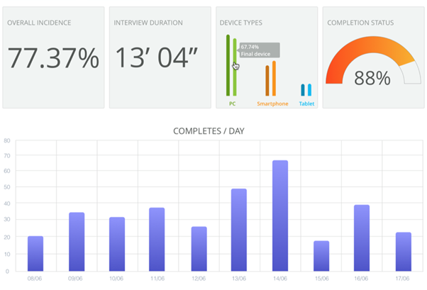
Today’s version of that researcher paints quite a different picture. She’s got a twinkle in her eye and a spring in her step. Work from the initial brief to online report delivery took only a day and she has absolute confidence in the near real-time findings it flagged up and, consequently, in her business insights and recommendations. The results are clearly presented on an interactive, intuitive dashboard that enables her to quickly shallow-dive, deep-dive, test and manipulate the data from whichever device suits her. She’s neither dazzled nor overwhelmed by the data; she’s empowered by it.
Excellent data visualisation is key to improving the work environment of research professionals. We believe that it’s not all just about delivering cost and time efficiencies and truly insightful, impactful data. While the end result is an incredibly user-friendly and insightful report, it’s also of paramount importance that our users’ experiences are inspiring, stimulating, enriching, smooth and enjoyable.
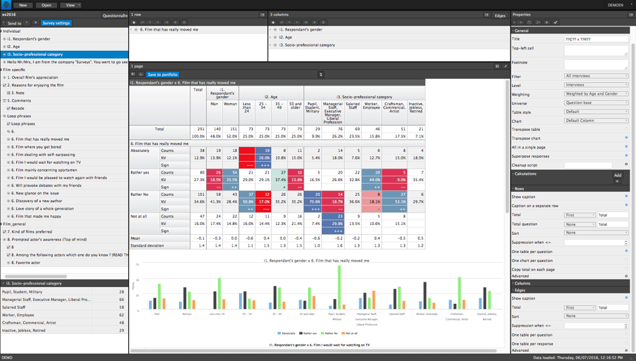
Ipsos and Askia are jointly building the tools that bring the data to life, that enable it to tell a story and paint a picture. It is, after all, at the visualisation stage that the researcher gets to be creative, to challenge and test patterns and hypotheses as new variables flag up new noteworthy findings. This is market research of substance and quality served up in technicolour, in stereo and with all the trimmings.
This article originally published in the 3rd special edition from Mr Web focusing on Data Visualisation.