Let’s face it – there are still way too many boring questionnaires around. They can take so long to complete – some make Tolstoy’s War & Peace look like a tweet! These types of surveys can lose a respondent to our industry for months, if not years. We all know this. We see people speaking out about this at every conference and summit, but still we see the tedious surveys.
But we at Askia are not going to give up: so this is another call to arms to apply the advice we provide to our Market Research clients on how to enhance the user experience & how to be more respondent-centric:
- Engage with the respondent
- Simplify the process
- Decrease the time between the request and the service/product provided
- Tease them and listen to them
You have one chance to catch the respondent’s interest. Make sure you take it!
Engage the respondent
Don’t just focus on the survey. The game begins with the invitation!
It’s very much recommended to clearly explain the aim of the survey and the time needed to fill it in. Don’t under-estimate the time. If you do then they might get to the end of this survey, but they might not even bother to start the next one.
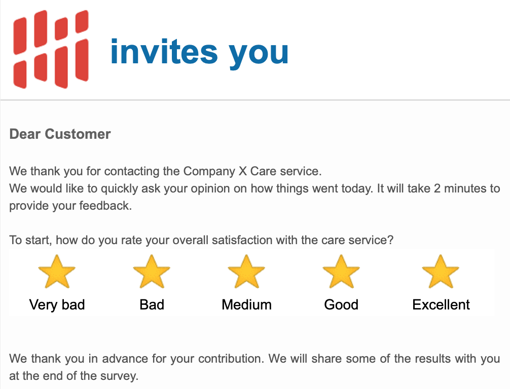
Let them know that they will receive an incentive for their precious feedback and time dedicated to the survey. You don’t need necessarily to pay them back with cash, so it could instead be the participation in a decent lottery prize or even simply providing some of the survey results . . .
When you write the survey invitation imagine what you would appreciate when you receive these yourself: you want to understand quickly the aim of the survey, so keep the content as simple and as short as possible.
Embed your first question in the message.
Simplify the process
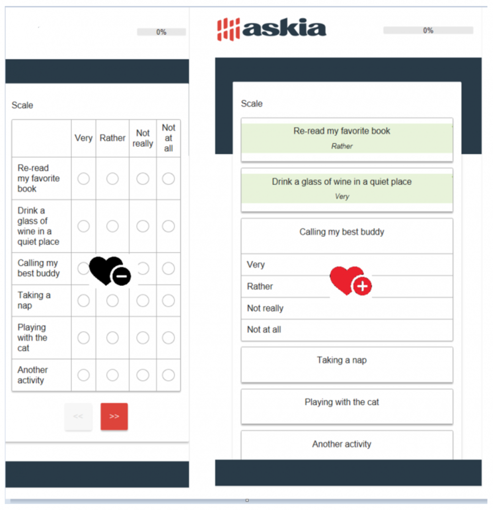
You don’t know which device the respondent will use to fill in the questionnaire. Now I don’t need to tell you that the questionnaire must be responsive and the questions displayed in a way that it makes easy to reply without any brain gymnastics on any device. So make sure that you use your survey platform’s responsive question sets. In Askia these are there by default.
Below, the grid question shown on the left is dull & repetitive to fill in and in a non-responsive survey there is a chance on small screens that some of the answer columns will be hidden from the respondent. The image on the right shows the same grid question, but formatted in a way that is easier for the respondent to fill in and will definitely not have any answer categories hidden from view, off the screen.
Encourage them to give more . . .
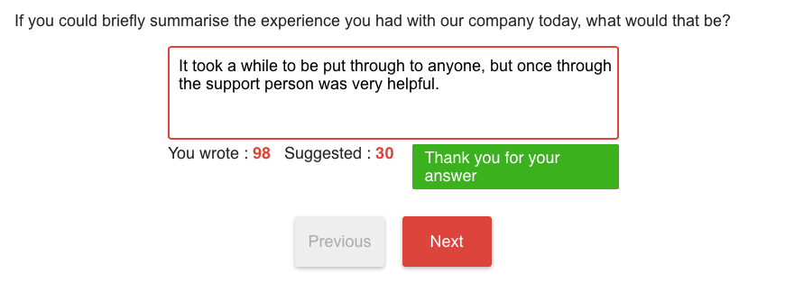
Voice recognition with auto-transcription on open-ended questions is an excellent option, especially for respondents who use their mobile phones. It’s easier for the respondent to provide you with their views and you will receive more and better content than just typing.
Add suggestions on the amount of content you are looking for. If possible, describe how much content has been provided so far, compared to what is expected.
And you can also program in special messages for reaching the suggested amount of content and/or for keywords that are entered (e.g. my favourite, excellent company, best taste, etc.)
Finally, Reward them!
If you have promised an incentive, explain as soon as possible after the survey that the reward is due and be clear about how it will be made available & when. As a software provider, we occasionally get disgruntled respondents who have been left high and dry by the agency using our software – these people are generally very angry, so we know first-hand the pain that respondents feel when something goes wrong with the incentive system. We always do our best to reconnect the respondent to the agency that is managing the project.
And as promised, we can also provide them survey feedback at the end of the survey!
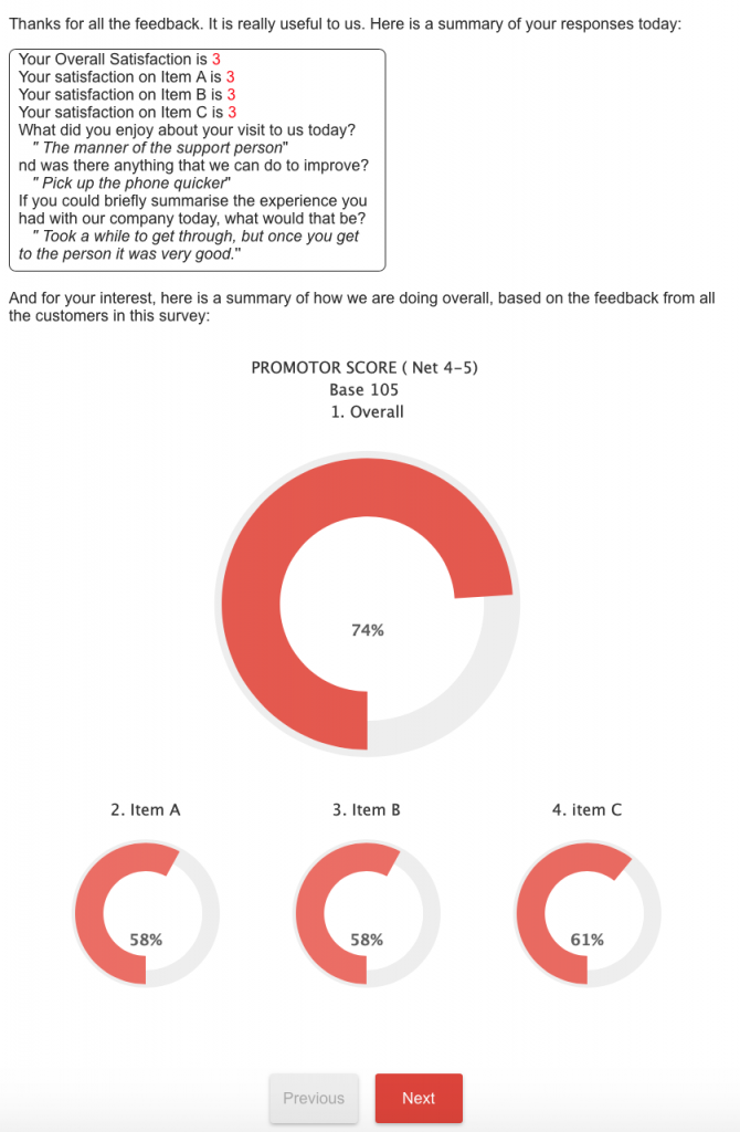
If you want to see more, have fun and fill in in our demonstration survey, showing examples of what we have just described, please click on the following link – Mail Invitation Survey Example
Meanwhile, please, please, please keep creating your most engaging and respondent-centric surveys 🙂
