The word titanic means ‘of exceptional strength, size, or power’ and we’d like you to keep this in mind when reading this latest blog showcasing AskiaAnalyse’s ability to link with R or Python, producing amazing analyses we could never run before in the Askia world!
Background
The dataset we will explore contains information about a sample of 889 passengers aboard the ill-fated Titanic, which was a British passenger liner operated by the White Star Line that sank in the North Atlantic Ocean in the early morning hours of 15 April 1912, after striking an iceberg during her maiden voyage from Southampton to New York City. Of the estimated 2,224 passengers and crew aboard, more than 1,500 died, making the sinking one of modern history’s deadliest peacetime commercial marine disasters. RMS Titanic was the largest ship afloat at the time she entered service and was the second of three Olympic-class ocean liners operated by the White Star Line.
But first, before we dig into the analyses, an ‘honourable’ mention:
Masabumi Hosono was a Japanese civil servant. He was the only Japanese passenger on the RMS Titanic’s disastrous maiden voyage. He survived the ship’s sinking on 15 April 1912, but found himself condemned and ostracised by the Japanese public, press and government for his decision to save himself rather than go down with the ship.
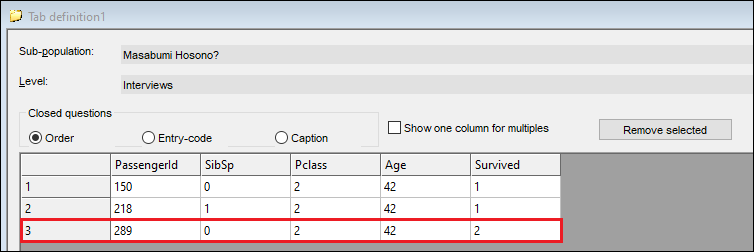
Whilst there is no variable in the data such as dishonoredNationID or publiclyOstracisedFlag, a bit of super-sleuthing on his Wikipedia page and named datasets online gave me enough information to isolate a few contenders, and a prime candidate in our dataset: PassengerId=289.
There are countless tragic individual tales to recount from this event, but can we use the data to shed some more light on factors which affected a passenger’s ability to survive the disaster, just like Mr. Masabumi Hosono?
Where to start?
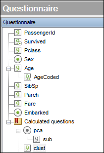
Excluding the survived flag and the passenger id, we have seven variables in the Titanic dataset: five numerical and two categorical.
We want to run some exploratory analysis first, with the aim of gaining more insight into the data set and its underlying structure, as well as making it easier to analyse.
In this case, these aims are well met by running a dimensionality reduction exercise (crystallising the important information in all the variables to a handful of richer ‘predictor’ or ‘latent’ variables) and then running some cluster analysis.
A well-known and simple dimensionality reduction method is principal component analysis (PCA).
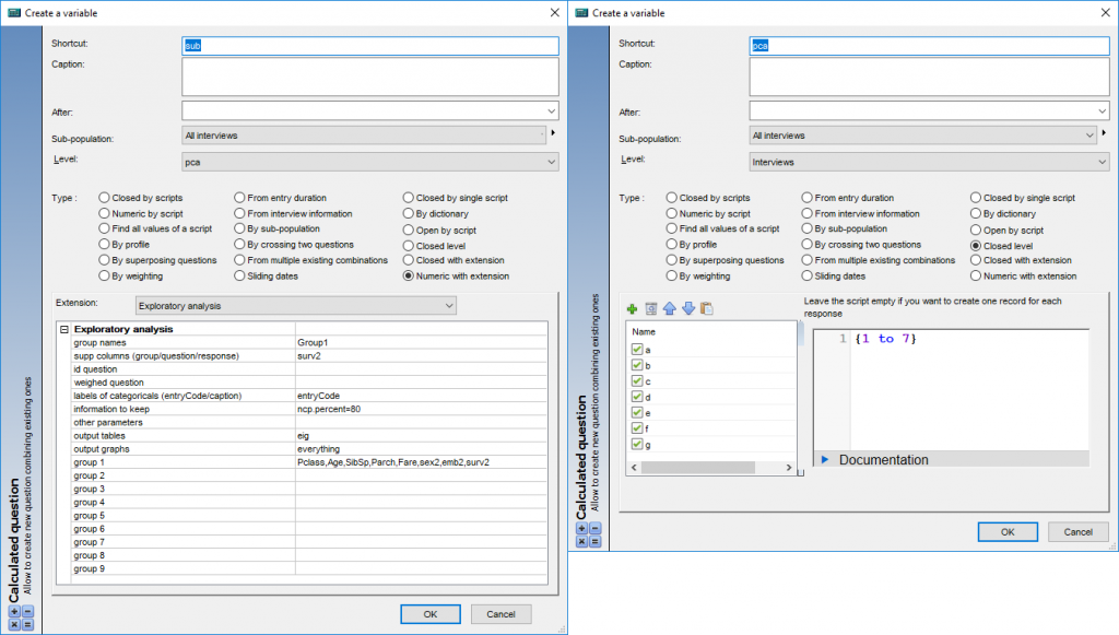
AskiaAnalyse Extensions provide many advanced analyses including ‘Exploratory analysis’ which runs PCA and other methods, based on PCA (specific to the type of the variables used).
- PCA: principal components analysis: only numerical variables
- MCA: multiple correspondence analysis: only categorical variables
- FAMD: factor analysis of mixed data: numerical and categorical variables
- CA: correspondence analysis: only two variables (contingency table)
- MFA: multiple factor analysis: when you have variables set by group
The output plots depend on the type of analysis listed above.
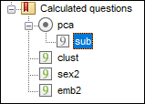
Our dataset includes both categorical and numerical variables, hence FAMD analysis will be run. However, we want to have some special outputs (variable factor maps) only provided by PCA. So, we transform the two categorical variables into numerical (sex2 & emb2). Selecting these instead of their categorical counterparts will force the program to run PCA and output the desired plot.
We also have the variable: ‘Survived’ which is used for supplementary purposes. A supplementary variable does not affect the calculation of the PCA but still allows us to see it in the same space and draw conclusions about the factors correlated with survival. The PCA here will be run in R and write its data back to AskiaAnalyse.
When choosing the number of dimensions to reduce our seven variables to, we can use one of several rules of thumb to pick several principal components from the scree plot produced by running the exploratory analysis R-extension:
Scree plot output to the datafile’s .dat folder by running the above:
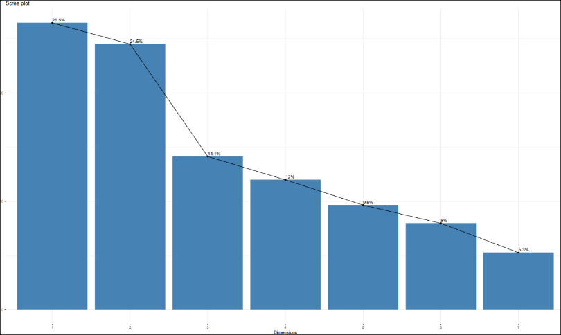
- Keep the components before the biggest drop off in % information (1 & 2)
- Keep the components which cover 80% of the information (1 to 5)
- Keep the components which have more than average information (1 to 3) – this is the rule we will use here.
The most important result from a PCA is the percentage of explained variance from the scree plot above. It shows how much information each component represents. For this dataset, each variable, by default, represents an average of 100%/7=14% of the total information, so we can say that a component is good when it has more than 14% of the total information.
The first two components have over a quarter each. They are rich latent variables. In fact, with only the two of them, we can explain more than 50% of information included in the dataset. The 3rd component has 14% (the average/threshold), it might be helpful. We will keep it as optional and use it if we want to go deeper into the analysis.
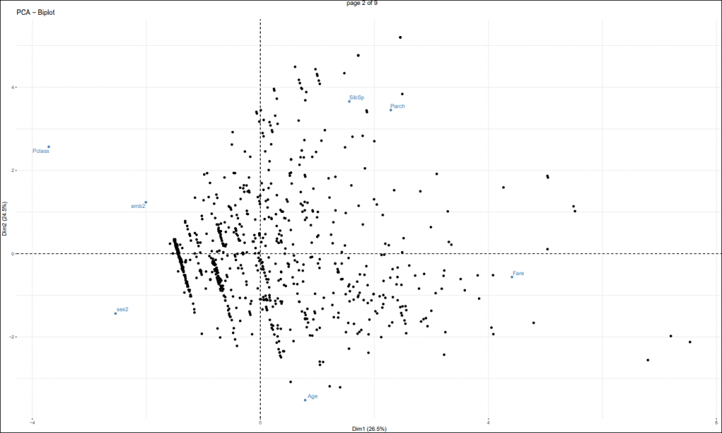
Another important result from PCA is the variable factor map:
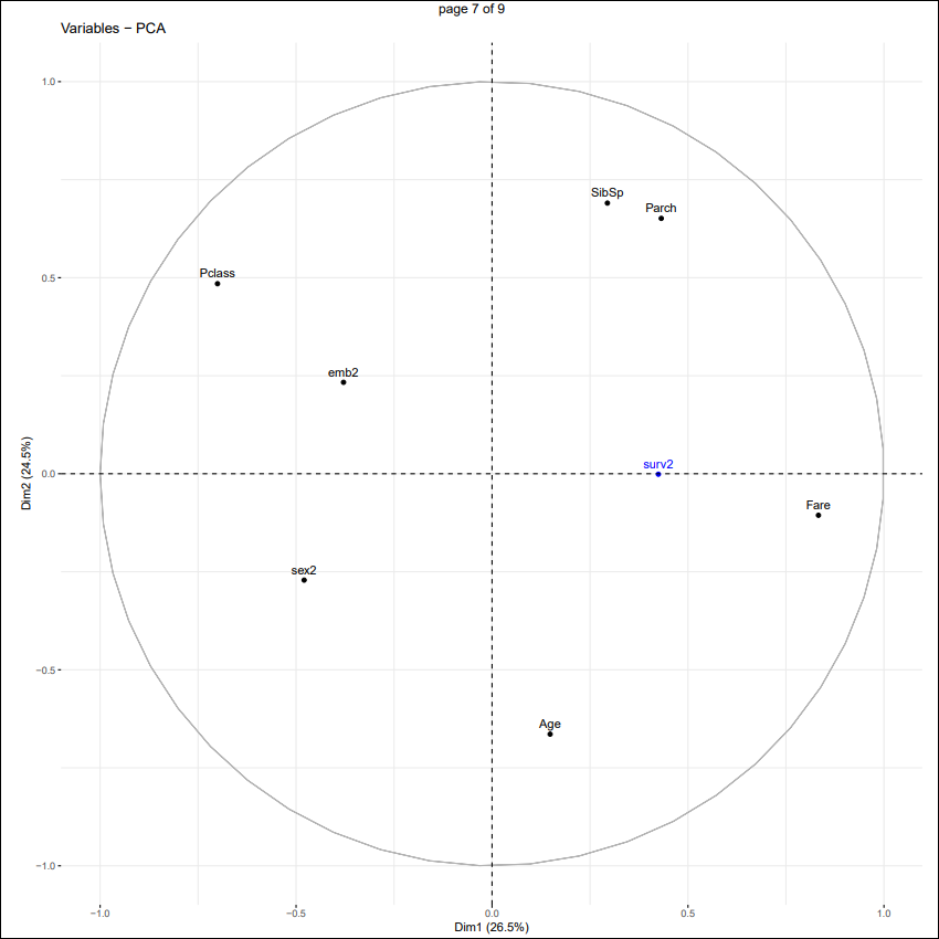
As a reminder, a component corresponds to a linear combination of many variables, some are more important than others. With the help of factor maps we will be able to give an interpretation of each component perhaps give it a “name”.
Some tips of interpretations:
- The further a variable lies from the origin, the more important it is
- The closer together two variables are, the more correlated they are
- The further apart two variables are, the more negatively correlated they are
- As you move to the opposite side of the diagram from where the variable is plotted, its value decreases
We have here as the X-axis the 1st component and as the Y-axis the 2nd component.
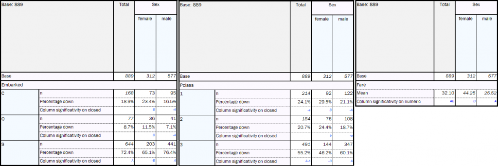
1st component: The most important variables are ticket price (Fare) and the passenger class (Pclass) which are highly negatively correlated. This is as expected: the higher your fare was, the better your class will be (1st class > 2nd class > 3rd class). Also, since sex and embarkation port are close to passenger class, that suggests women are more likely to have paid higher fares and more likely to have embarked from Cherbourg and Queenstown than men. This is supported by the sig testing in the regular tables AskiaAnalyse shown below.
The other variables are too close to the origin to be able to draw a conclusion.
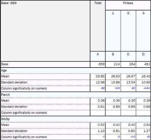
2nd component: The most important variables are passenger class (Pclass), number of siblings/spouses (SibSp) and number of parents/children (Parch) against passenger’s age. We can say here that people who travel with families (higher values for Parch & SibSp) are going in 3rd class, although they might sometimes pay a big fare (variables closer to fare regarding 1st component). Furthermore, on average, those who are in 1st class are older.
What can we say about the chances of surviving?
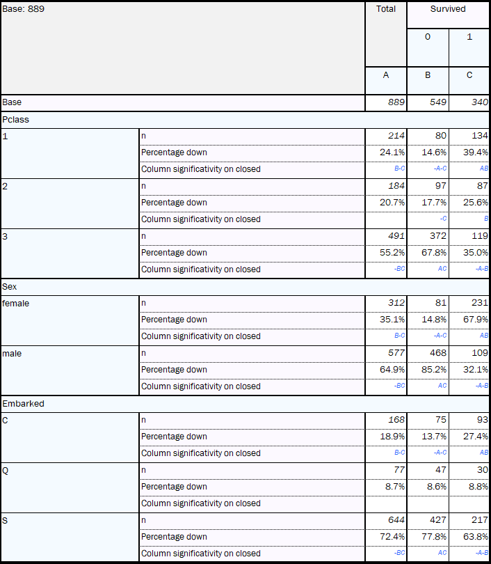
Globally (1st/2nd components), the fare was the closest to survival. So, we can say, the higher your fare, the greater was your chance of survival. Moreover, sex and embarkation were also negatively correlated to survival. So, women and people who embarked from Cherbourg will tend to have had a better chance of survival.
The sets of crosstabs shown left are all created through the regular table functionality of AskiaAnalyse. One of the pros of PCA is the ability to deliver this same information in a quick and crystallised manner. This efficiency of PCA over crosstabs becomes starker in data-sets with many more variables as there will be many more tables to review and extract the same insights.
To summarise:
- Top: families
- Bottom: older age
- Left: men, embarkation at Southampton and 3rd class tickets
- Right: higher fares
The last main result to look at is the individuals factor map:
Here we see all the passengers and how they are related to the variables in the same plot. The next stage will try to build more well-defined clusters from this plot. Currently we don’t see very well-defined clusters here and this will be reflected in the silhouette score (explained later) which is a measure of how efficient your cluster analysis is.
Now, thanks to the previous analysis, we know generally the behaviours of the passengers. Hence, we can use Clustering methods to divide the passengers into different groups with similar profiles.
The cluster analysis here will be run in Python and write its data back to AskiaAnalyse.
Configuration:
Analyse Extension’s ‘Clustering (after PCA) analysis’, allows you to choose:
- the data from the PCA’s results
- the number of components we need to keep
- the number of clusters we want – this parameter can be set as a range, the program will test all of them and choose the optimum by evaluating the silhouette score for each.
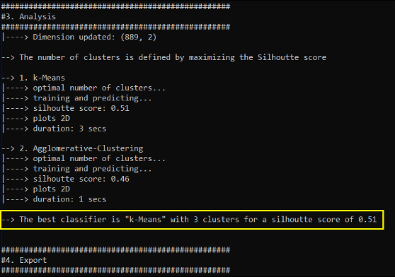
Two clustering methods have been included: k-means and Agglomerative clustering. An output for each will be produced in the .dat folder.
For this analysis we are going to keep to the first two components from the PCA run previously. Since we don’t know how many clusters to create, we’re going to test between two and six.
Results
A good classifier (general name of clustering method) is when:
- [1st rule] in the same group the population is as similar as possible,
- minimise the intra-cluster variance
- [2nd rule] any two groups are as different as possible.
- maximise the inter-cluster variance
There are countless indicators allowing us to measure the performance of a classifier – some prioritise the 1st or the 2nd rules, and others do a mix a both.
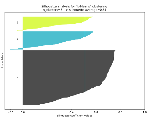
The silhouette score is a good indicator because it mixes those two rules (min intra variance AND max inter variance). It ranges -1 to 1. The higher the score, the better your clusters.
From the output console, we can read that the best classifier obtained is k-Means with 3 clusters. Which gives us a score of 0.51 (not bad).
Finally, we need to interpret and give a description to each cluster by using the results from the previous PCA analysis. Note that the x & y dimensions displayed in the plot below are the first and second components identified and used from the PCA.
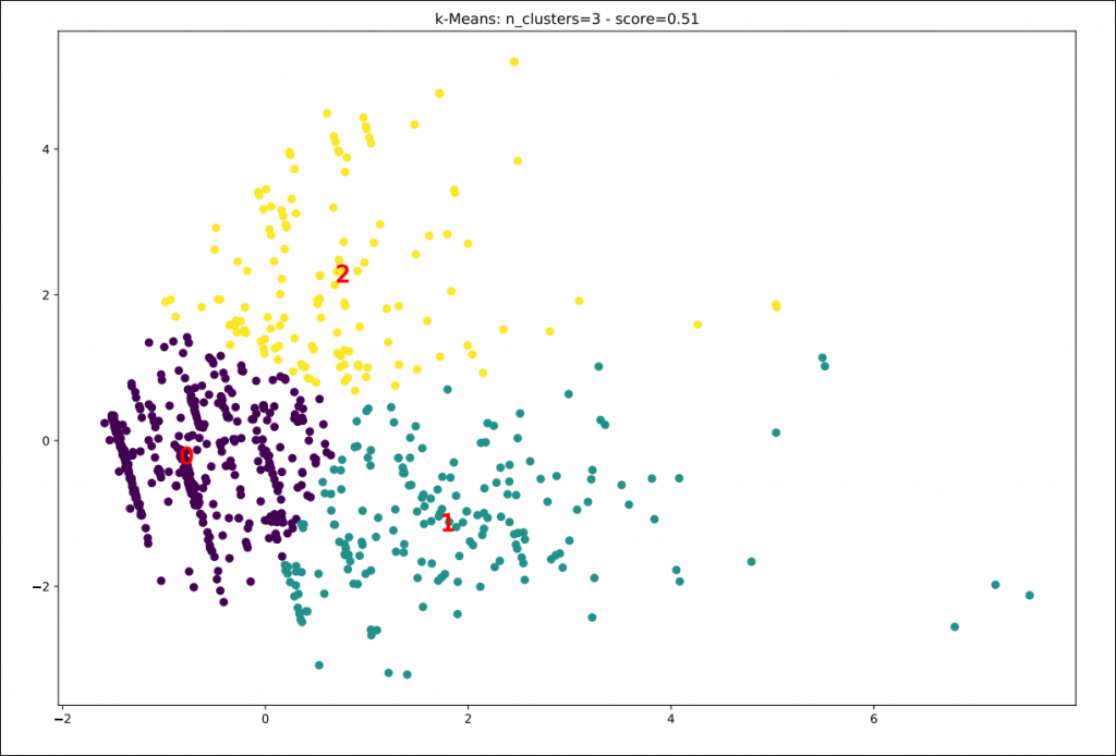
Cluster 0: – 562 passengers (mid-left): [Male solo travellers]
- Men
- Southampton
- 3rd class
Cluster 1: – 186 passengers (bottom-right): [Wealthy older & women cruisers]
- Older passengers
- Passengers with higher fare
- Women
Cluster 2: – 141 passengers (top): [Budget family travellers]
- Passengers travelling as a Family.
- 3rd class
To get the same information without PCA would have been more complicated. We would have to:
- run the clustering on all seven variables
- go back to analyse and make crosstabs between the clustering and source variables
- then for each couple of clusters/variables analyse which patterns are the most important
In conclusion
If you have seen the 1997 James Cameron movie, Titanic, you should be able to spot which clusters the two lead characters belong to. Kate Winslet’s Rose DeWitt Bukater would surely be a part of Cluster 1 whilst Leonardo DiCaprio’s Jack Dawson would, with equal certainty, belong to cluster 0.
Recalling where the survival variable lies on our previous plots, we can see that ticket class, and likely therefore wealth, is a main factor contributing towards chances of survival, along with being female. The chances of male travellers from a poorer background did not rate so highly.
Remember, AskiaAnalyse instructs the external software (R & Python in this case) to run the analyses and write back the data to the variables in the .qes or .qew file. This means you can use these variables in further analysis such as crosstabs.
We can go deeper into the analysis by selecting more components from the PCA. In this case, we might find more interesting and not-so-obvious insights.
*Main image courtesy of https://www.desktopnexus.com