
The debrief is going well, the change in direction the end client needs to take is understood, the meeting is coming to a conclusion. Then the quiet one in the room asks you to go back to slide 26 – it’s the slide with one of the key tabulations with the important figures highlighted in green. The bomb is dropped, “The numbers don’t add up”. The numbers in the cells don’t add up. Everyone counts them. She is right. The researchers look at each other. They count again. No, she really is right. “What software are you using for this analysis?”. “Not sure, we will need to speak with the DP team”. Suddenly there is a bit of doubt in the room. The meeting ends with a question mark.
I am sure that many of us have seen or heard something like this at some point and I am also sure that many of you will know exactly what has happened. But for those who have not yet experienced this issue and would like to arm themselves with why this can happen and how you can easily explain what is going on, here is an example . . .
This scenario usually occurs when we are working with weighted data. In weighted data, we apply a numeric weight factor to each respondent and so each respondent goes into the calculations slightly greater than or less than 1. This means that weighted data is no longer dealing in whole numbers, but in numbers with decimal places. Researchers don’t often like to show counts of respondents with decimal places – how can you have 87.6 people liking something? So usually counts are rounded to the nearest whole number.
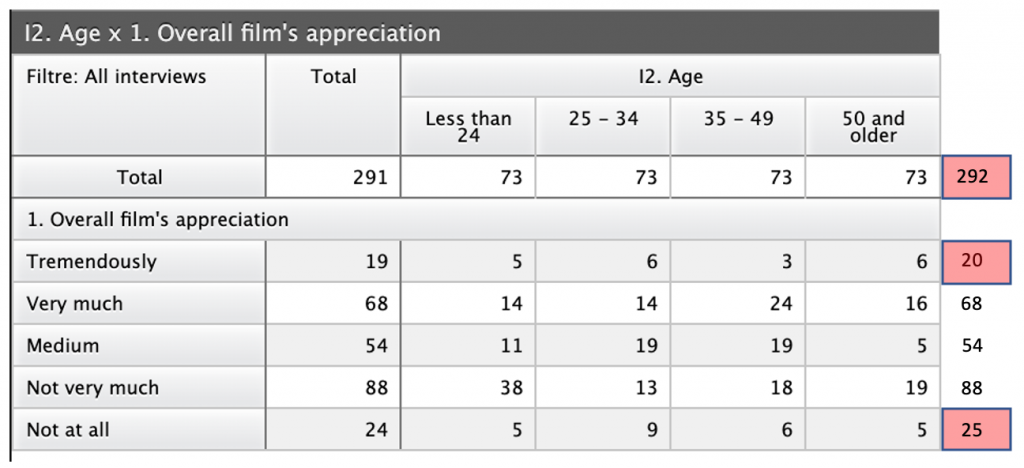
In the above table we have a mismatch on the column total and in the first and last categories of the film appreciation question. This is due to rounding. Adding a decimal place explains exactly what is going on, as you can see in the table below.
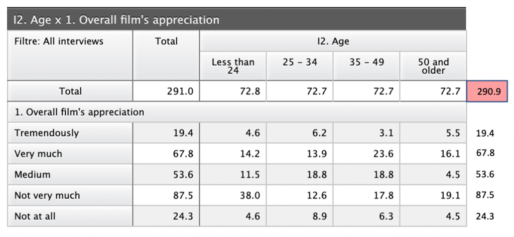
You can see that when we have one decimal place, the numbers in the cells all sum to the same as the total. The only exception, where we still have a mismatch, is in the column total, but the mismatch is just 0.1 and again, this is due to rounding.
This scenario can also happen if you choose to show percentages without decimal places, so I would discourage that, as people generally like to see percentages add up to 100, rather than 99 or 101.
So to round things off (groan), make sure you have a good understanding of the dangers of a lack of a decimal point, before your next client debrief.
Postscript: my colleague Jérôme Sopoçko, who writes much of the code for Askia’s reporting solutions says that from a development point of view, decimal numbers in all programming languages are an approximation and that there are a number of areas a developer needs to be fully aware of when creating analytical software. He recommends the following abstract as a good source of information regarding this area: “What Every Computer Scientist Should Know About Floating-Point Arithmetic”, by David Goldberg.